Kat Krush is an independent British streetwear label built around what it describes as Quiet Confidence. Based in the United Kingdom, the brand takes a restrained approach to contemporary streetwear, working with heavyweight garments, oversized silhouettes and minimal graphic treatments, with an emphasis on quality, structure and longevity in design.
Rather than relying on visual noise or rapidly changing trends, Kat Krush explores how simple garments and considered details can create their own identity. Architecture and place are central to that approach, with British cities represented through materials, atmosphere, light and geographic coordinates rather than conventional landmarks or city imagery.
The idea behind Kat Krush came from founder Peter, who had previously built and sold a consumer-facing business before moving into other ventures. Over time, he found he missed the challenge of developing something from the ground up and, particularly, the direct connection that comes from creating a product people genuinely respond to.
Clothing and design became his next challenge. Peter felt there was room for a more minimalist approach, centred on good quality clothing with designs that have longevity rather than being driven by short term trends. That thinking became the starting point for Kat Krush.
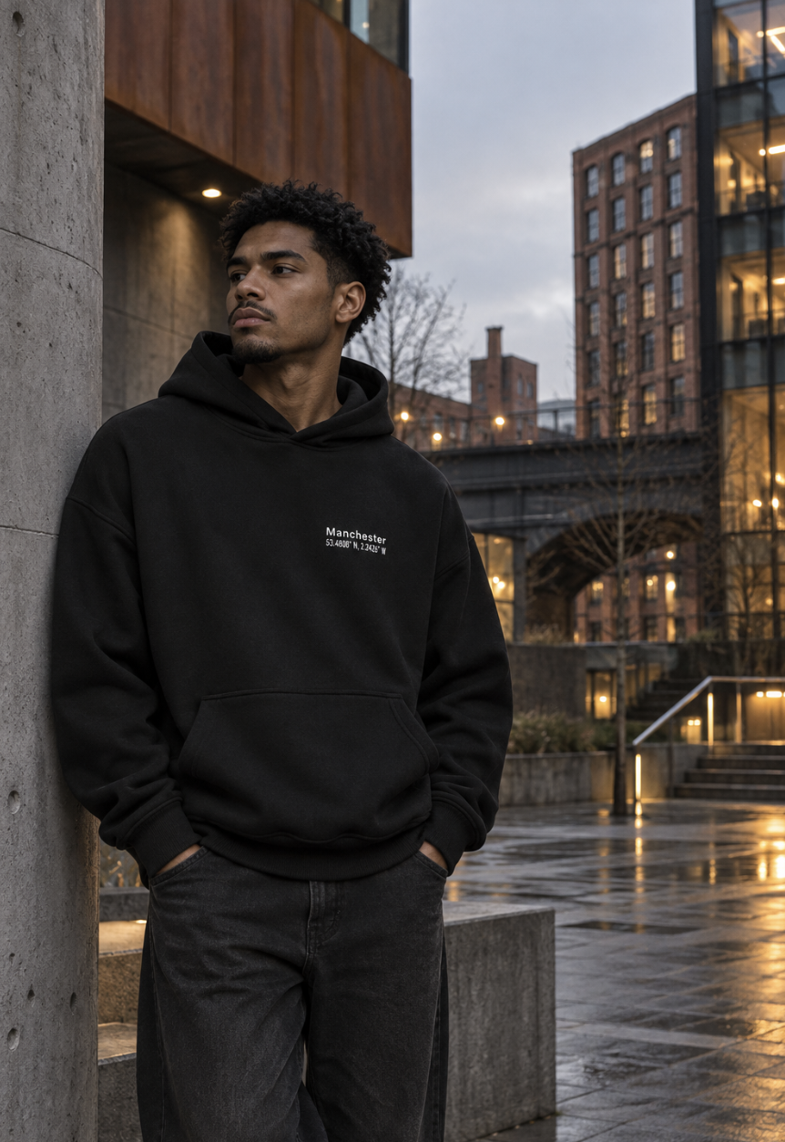
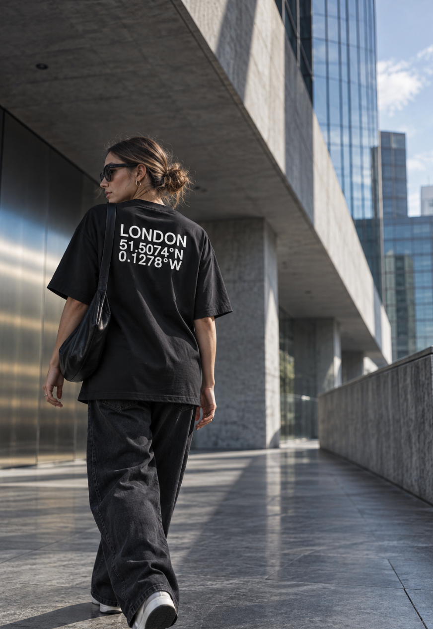
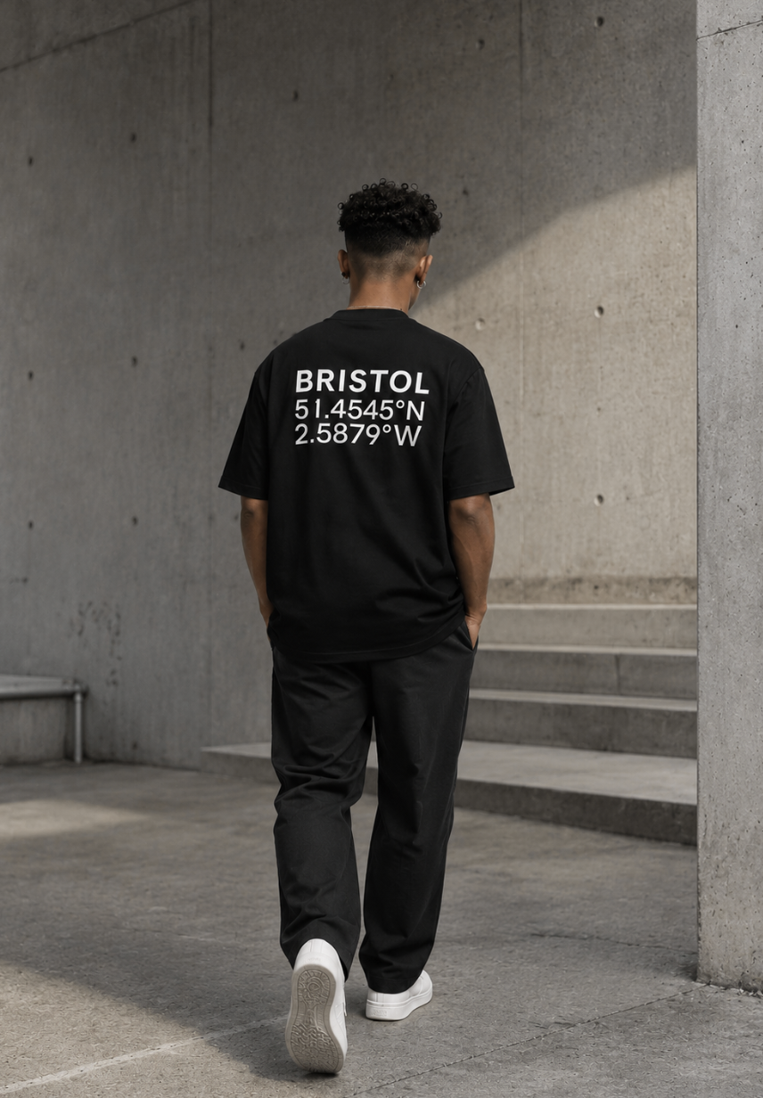
That philosophy comes through in Coordinates, a collection exploring the relationship between architecture, identity, clothing and place. It focuses on London, Manchester, Birmingham, Bristol, Liverpool and Leeds, with each city represented through its geographic coordinates and its own architectural and environmental identity.
The collection deliberately avoids treating the cities as tourist destinations. Instead of famous landmarks or souvenir style graphics, Kat Krush uses contemporary architecture, materials, light, atmosphere and movement. The brand describes the concept as “Not a souvenir of the city. An expression of belonging to it.”
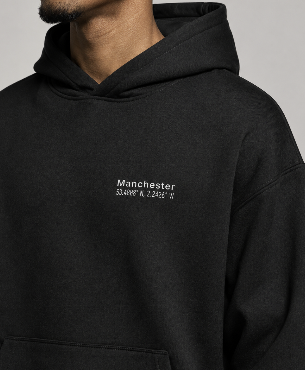
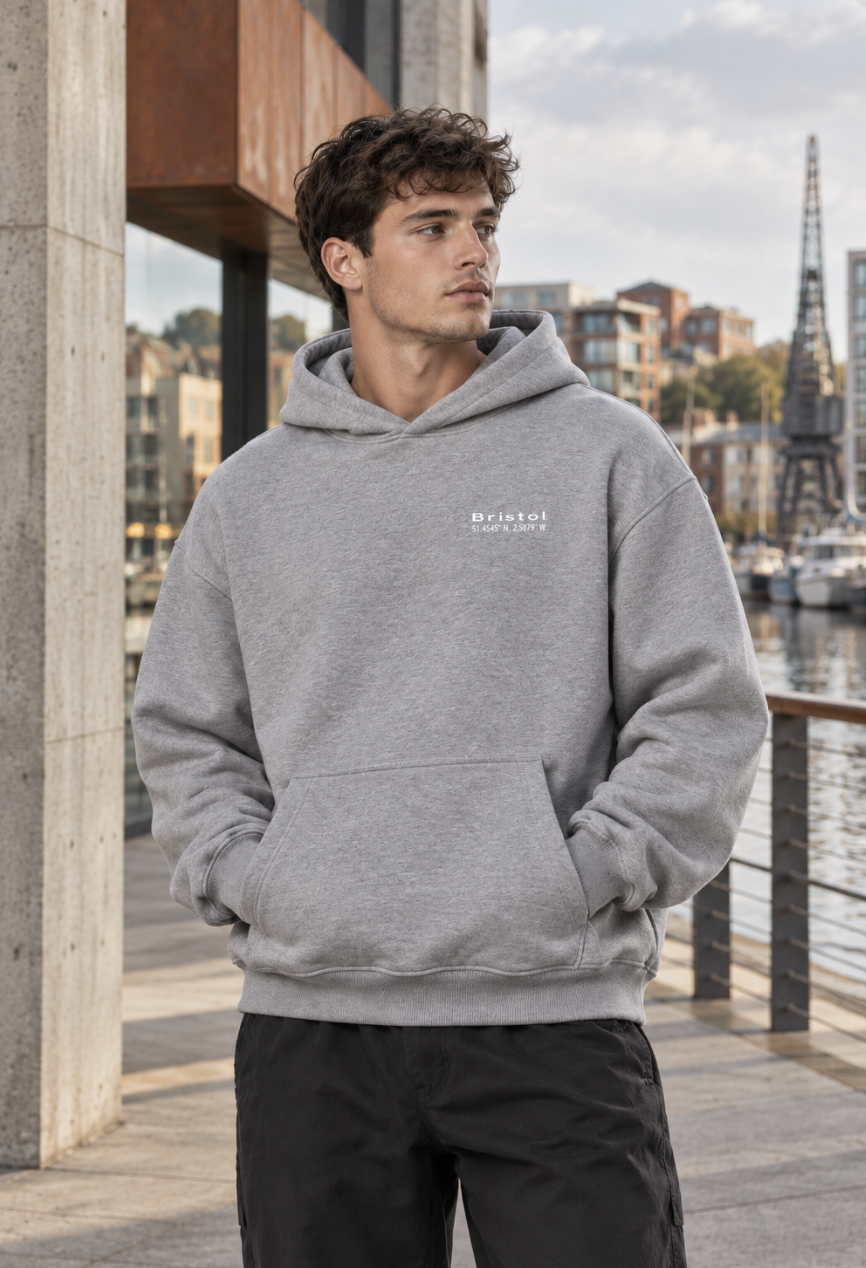
Signature takes the same idea in a quieter direction. While Coordinates uses a larger rear city treatment, Signature reduces the identity to a subtle city name and coordinates positioned on the left chest. The collection includes heavyweight oversized T-shirts and hoodies, retaining the structured silhouettes and understated branding found across the label.
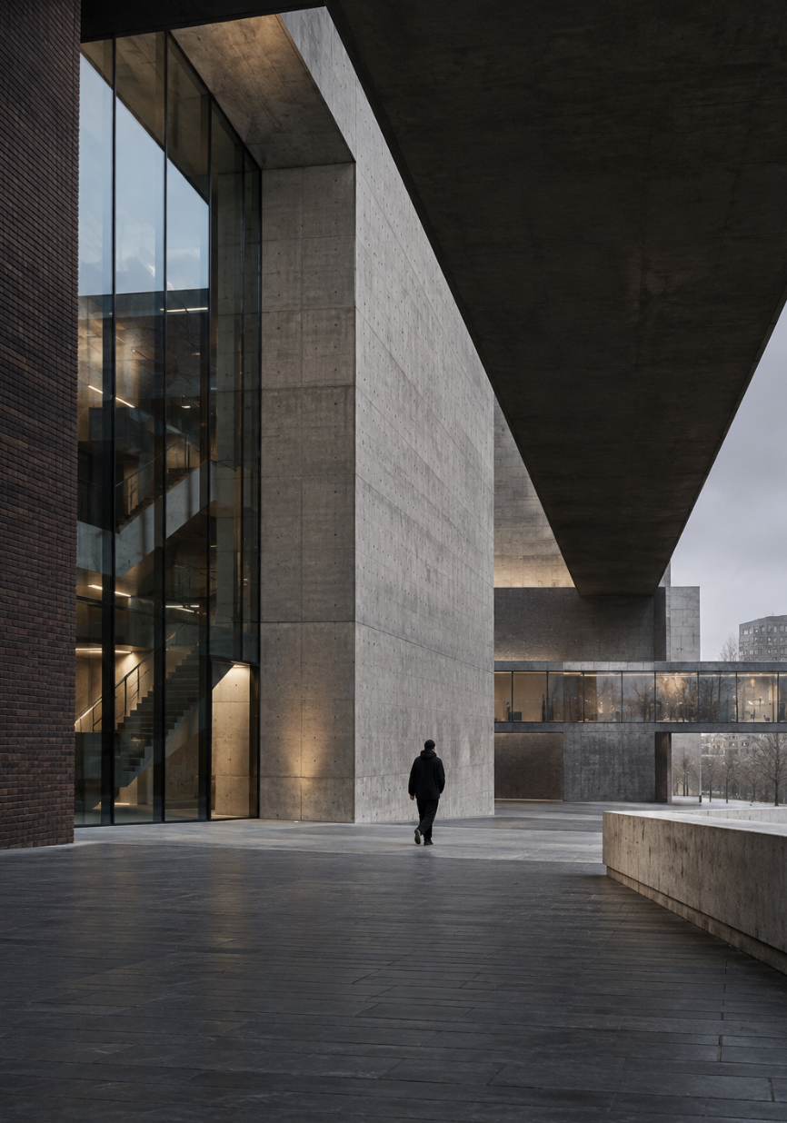
Architecture also features heavily in Kat Krush’s visual language, with concrete, brick, steel, glass, structural shadows and natural light providing the environment for the clothing. The brand draws colour from building materials, changing light, reflections, water and the surrounding city, while keeping the garments deliberately restrained.
Across the collections, the philosophy remains consistent: fewer elements, considered carefully, with an emphasis on longevity rather than constant reinvention.
Quiet Confidence. Less Noise. More Intent.